There is nothing better than learning that traffic to your Ecommerce website is on the rise. This means all the time you invested in increasing your site awareness is paying off! It’s a great feeling!
While more traffic puts you in a position to boost sales and revenue, these benefits aren’t guaranteed. Here’s why: you never know if all those new visitors will convert into customers.
This is where Ecommerce conversion rate optimization comes into play. By developing a user-friendly website with content that forms an emotional connection with visitors, you’re able to do the following:
- Increase conversion rate
- Improve SEO
- Establish a better relationship with your audience
What’s a good Ecommerce Conversion Rate?
Average Ecommerce conversion rates fall somewhere between 2% and 3%. This means that, out of every 100 visitors to the site, only 2 or 3 will actually make a purchase at a given time. The rest are just browsing. The averages are highly dependent on how niched your service area is.
Now, on a larger sample, if you have 10.000 website visitors a month or more, and you’re in a common industry with a very broad target audience, but you get less than 200 sales per month across all channels, you may want to consider whether your conversion tactics are as optimized as they could be.
Identify What’s Hurting Your Conversion Rates
It’s not always easy to pinpoint why visitors aren’t converting into customers. Fortunately, when you take a step back to understand some of the most common issues, it’s easier to understand what’s going on.
Here are some things that could be holding you back from seeing the conversion rates you want:
- Inconsistent organization of page types in the navigation bar
- Combining collection/product and marketing pages, thus harming the effectiveness of both
- Product descriptions that lack content that speaks to your audience and forms an emotional connection
Yes, it’s frustrating to find that your website is falling short in one or more of these areas. And yes, it will take some time and resources to make things right.
However, if you neglect to tackle these issues using Ecommerce conversion optimization strategies, you’re holding your brand back from reaching new revenue heights.
Find the Right CRO Solutions for Your Visitors
Now, it’s time to dig into the three issues detailed above, along with examples of how to take action using Ecommerce conversion tips.
1. Inconsistent Organization in the Navigation Bar
Let’s face it: many people head straight for the navigation bar upon reaching your online store. This is particularly true if they land on your home page, or are looking to browse the website after entering a product landing page.
With consistent navigation bar organization, it’s simple for visitors to find what they’re looking for.
Conversely, if your navigation bar lacks consistency, you’ll chase visitors away before you ever have the chance to convert them into paying customers.
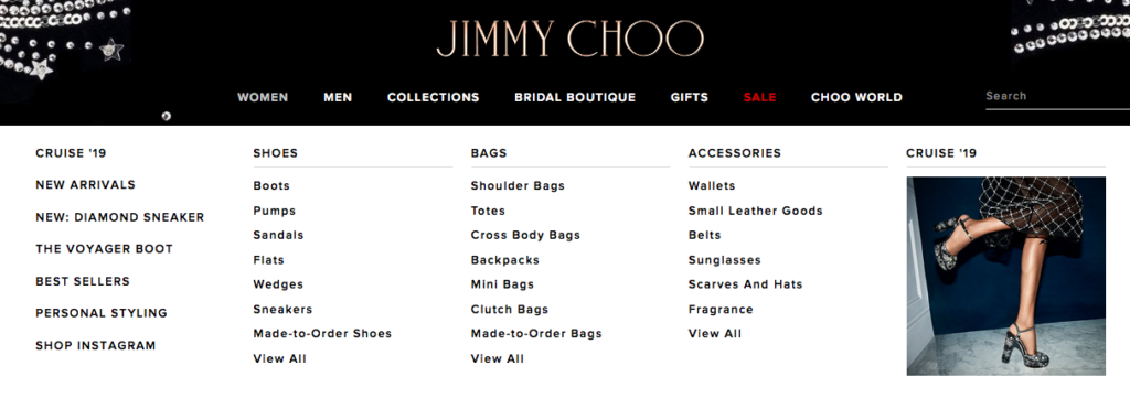
JIMMY CHOO is a great example of a brand that does everything right in regards to navigation bar organization.
Here’s what you see before doing anything else:

Now, if you’re interested in learning more about a particular category, all you have to do is hover over the appropriate text.
For example, if you’re shopping for “women” products, this is what you’ll see:

There’s no guesswork here. Everything is easy to find, thanks to the five column layout.
If you’re shopping for shoes, you know where to find each type. The same holds true for bags and accessories.
Keeping with the “consistency” theme, every other category, such as men’s and bridal boutique, are laid out in the same manner.
This may not sound like a big deal to you, but that’s because you’re familiar with your brand’s online store and its layout. For someone who has never visited in the past, consistency is a must.
2. Combining Collection/Product and Marketing Pages
For proper e-commerce conversion optimization, your collection pages should highlight products, such as by providing images, reviews, a clear description, and pricing information.
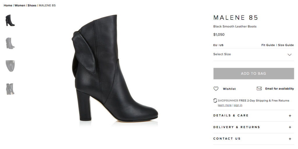
Sticking with the JIMMY CHOO example, here’s what a product page should look like:

Not only is everything where you expect it to be, but visitors don’t have to work to find additional information.
Now, imagine what a visitor would face on a page that combines product and marketing information.
It may sound like a good idea to combine the two, as it provides more information on a single page, but it actually works against you in two ways:
- Too much information clutters the page, making it difficult for users to navigate
- You don’t have the opportunity to optimize two pages for search engine traffic, thus potentially missing out on traffic
By separating collection/product and marketing pages, you provide a better user experience along with the opportunity to secure more organic traffic.
3. Product Descriptions that Lack Content
Even though images are crucial to capturing a person’s attention and securing a sale, product descriptions are just as important when implementing e-commerce conversion optimization. Not only does this provide the buyer with more information, but it’s also a good opportunity to add keywords with the idea of generating search engine traffic.
Product descriptions should meet these requirements:
- Long enough to provide solid information, but concise enough to keep the buyer’s attention
- Include a primary keyword, which typically matches the name of the product
- Speaks to your audience by forming an emotional connection
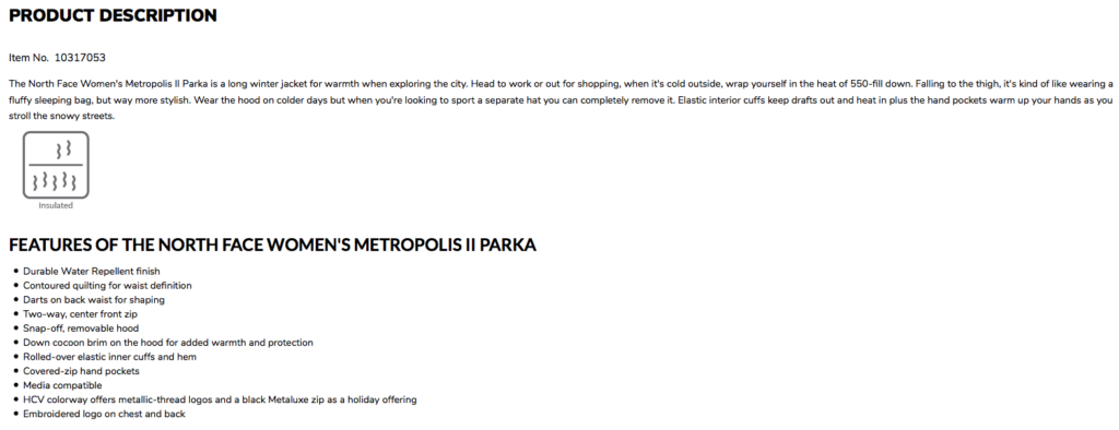
If you’re seeking inspiration, the Moosejaw online store is a great place to start. Here’s a description of one of its most popular products:

There are a few things to like here:
- At 100 words, the product description is long enough to include targeted details but short enough to quickly consume
- It includes the primary keyword “North Face Women’s Metropolis II Parka”
- It includes the secondary keyword “long winter jacket”
- A list of features for easy browsing
Best yet, the description forms an emotional connection with the buyer, thanks to phrases such as “wrap yourself in the heat of 550-fill down” and “it’s kind of like wearing a fluffy sleeping bag, but way more stylish.”
It makes you feel warm, comfortable, and stylish, doesn’t it?
Why is it important to optimize conversion rates for Ecommerce sites?
When you assess your website, pinpoint common issues interfering with visitors desire or ability to make a conversion, and implement solutions specific to your site, you’re putting your online store in position to boost its conversion rate. And when that happens, more sales and revenue will follow.
If you’re looking for expert SEO consultants to help with e-commerce conversion rate optimization, learn more about Fire&Spark’s Ecommerce SEO services today.

